Setting up a website favicon
Part 1: The Bare Minimum
A favicon (favorite icon) is a small square image on your website that is displayed in the browser’s address bar, page tabs, and bookmarks menu, Google or Bing search results, Windows shortcuts on your desktop, and more.
Having a proper favicon does not affect your website’s ranking in search results, but it helps users to recognize and trust your brand.
The most common image format for a favicon is ICO. The ICO image format was originally developed by Microsoft and is a multilayer image format. It can consist of multiple icon images, each with a different size and color depth. Popular formats for favicons are PNG and SVG. We’ll cover them (especially SVG) later in this article.
The simplest way to generate your favicon in ICO is to have it prepared in another image format (usually PNG) and then convert to ICO using specialized software (e.g., IcoFX) or online tools (e.g., favicon.io ↗).
This article covers how to generate a favicon in ICO image format using IcoFX on Windows.
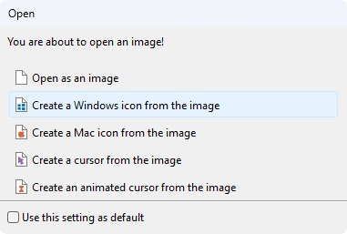
Open the PNG image in IcoFX with File → Open. In the “Open” dialog, select “Create a Windows icon from the image”.
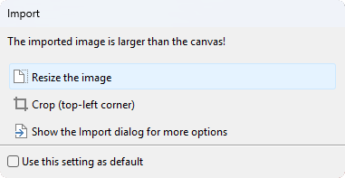
IcoFX may warn you if your image is wider than 1024px. In this case, you can simply select “Resize the image” in the “Import” dialog:
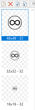
Depending on the size of the imported image, IcoFX generates multiple icons with different sizes on the left panel. It’s recommended that you use a base image that is at least 48px wide. We don’t need all the sizes generated by IcoFX for most web-related stuff, and will keep these three: “48x48 - 32”, “32x32 - 32”, “16x16 - 32”. You can delete the other sizes. Remove any you don’t need by clicking the red cross above the sidebar. In the end, the left sidebar should look like this:
Now simply hit File → Save and save your file as Windows Icon (*.ico).
The proper way to include the newly generated icon on your website is to add a <link> tag to the <head> section of the document:
<link rel="icon" type="image/x-icon" href="/path/to/favicon.ico">
Note: If you need a quick solution, you can use a PNG favicon. Simply resize your PNG image to 48x48 and link it to the document. According to Can I use ↗, PNG favicons are supported across all major browsers.
<link rel="icon" type="image/png" href="/path/to/favicon.png">
People often copy the favicon.ico to the root of the website’s public directory:
<link rel="icon" type="image/x-icon" href="/favicon.ico">
Note: Modern systems and browsers may look for a favicon as a file named “favicon.ico” located in the root directory of the website if an appropriate <link> tag is not present in the <head> section of the document. It has historically become a common practice. However, avoid relying on browser implementation and always have your favicon properly declared via the <link> tag.
Part 2: Scaling on the Go: SVG Favicons
Your newly created favicon will work in most cases. In a browser tab or the bookmarks bar, a 16x16 image will be used; a 32x32 image as an internet shortcut icon on your Windows desktop; a 48x48 image as a browser shortcut item icon, and so on. However, some devices and screens require bigger icons. Supporting them all one by one doesn’t sound optimal.
Luckily, an image format like SVG (Scalable Vector Graphics) scales automatically. If the favicon source is available as .svg, that’s great; otherwise, there are online tools to convert from other formats. To include the SVG favicon on your website, add the following tag to the <head> section of the document:
<link rel="icon" type="image/svg+xml" sizes="any" href="/favicon.svg">
Some systems may still not support SVG favicons (e.g., Windows Internet Shortcuts). It’s a good idea to have a fallback to the standard ICO format:
<link rel="alternate icon" type="image/x-icon" href="/favicon.ico">
<link rel="icon" type="image/svg+xml" sizes="any" href="/favicon.svg">
Note: The keyword alternate in the rel attribute of the fallback icon is optional and can be omitted. I prefer to keep it for semantic purposes, i.e., an alternative version of the default icon.
Using a fallback favicon seems to be a common practice. For example, here’s the GitHub source code that does the same:

Note: When you have two favicons, there’s no control over which one browser will select. For example, Google Chrome still selects the ICO favicon, ignoring its order. If you don’t need support for off-web cases (e.g., Windows Internet Shortcuts) and want to use SVG favicons only, you may prefer to remove the default favicon fallback. Modern browsers on both desktop and mobile support SVG favicons; please see Can I Use: SVG favicons ↗.
Some popular sources mention a trick that adds sizes="48x48" to the ICO favicon so browsers think it’s too large for a tab favicon and select the next favicon in the tree, that is, the SVG favicon. In practice, this appears to work only in Chromium-based browsers (e.g., Google Chrome, Opera). Firefox, for example, ignores it and uses the SVG favicon by default. This behavior was last documented in 2023 (see Kudamatsu’s article in the References) and still holds based on my quick tests in 2026. While the workaround may be practical for most people, it still feels a little hacky to me. The decision whether to use it or not is yours - I personally don’t use it on my blog.
Part 2.1 Supporting Color Schemes in SVG Favicons
Modern apps and websites often support both light and dark color modes. Ideally, we want our favicon to reflect these modes too. That’s not possible to do with ICO or PNG favicons. With SVG favicons, however, we can embed the <style> SVG element directly within SVG content and style our SVG based on the user’s preferred color scheme via prefers-color-scheme CSS media feature. Say you want your favicon to change its outline to white in dark mode, like it’s shown in the picture below:

Here’s how the code looks inside that SVG:
<?xml version="1.0" encoding="UTF-8"?>
<svg xmlns="http://www.w3.org/2000/svg" width="449.54" height="449.54" viewBox="0 0 449.54 449.54">
    <defs>
        <style>
            path { fill: black; }

            @media (prefers-color-scheme: dark) {
                path { fill: white; }
            }
        </style>
    </defs>
    <path d="M84.08,222.52c.4,41.04,18.92,61.76,55.55,62.16,28.83,0,52.95-20.32,72.37-60.96-17.42-38.84-42.34-58.66-74.77-59.46-35.03.6-52.75,20.02-53.15,58.26M225.22,0c81.48,0,145.94,36.14,193.39,108.41,20.62,35.64,30.93,74.67,30.93,117.12,0,84.88-38.04,150.65-114.11,197.29-32.83,17.82-70.17,26.73-112.01,26.73-83.68,0-148.65-37.24-194.89-111.71C9.51,305.4,0,267.26,0,223.42,0,138.34,39.24,72.27,117.72,25.22,151.75,8.41,187.58,0,225.22,0M313.21,164.26c-32.43.8-57.36,20.62-74.77,59.46,19.42,40.64,43.54,60.96,72.37,60.96,36.64-.4,55.15-21.12,55.55-62.16-.4-38.24-18.12-57.66-53.15-58.26M224.92,245.94v8.41h-.9c-23.62,37.84-53.25,56.76-88.89,56.76h-4.2c-28.03-3-48.15-13.71-60.36-32.13-12.21-18.62-18.32-35.94-18.32-51.95,0-1.4.1-2.9.3-4.5,0-.8,0-1.7,0-2.7,0-23.22,7.71-42.44,23.12-57.66,15.62-15.41,36.94-23.22,63.96-23.42,31.43,0,59.86,17.02,85.28,51.05,25.62-34.03,54.25-51.05,85.88-51.05,27.03.2,48.25,8.01,63.66,23.42,15.61,15.22,23.42,34.43,23.42,57.66,0,1,0,1.9,0,2.7.2,1.6.3,3.1.3,4.5,0,16.02-6.11,33.33-18.32,51.95-12.21,18.42-32.33,29.13-60.36,32.13h-4.2c-35.64,0-65.36-18.92-89.19-56.76h-.6l-.6-8.41M12.91,225.22c0,80.08,35.43,141.74,106.3,184.98,31.43,17.62,64.16,26.43,98.2,26.43h14.41c72.07,0,131.03-34.53,176.87-103.6,18.42-33.03,27.63-69.27,27.63-108.71,0-79.28-36.24-141.34-108.71-186.18-32.03-16.62-66.47-24.92-103.3-24.92-77.88,0-139.14,34.63-183.78,103.9-18.42,31.83-27.63,67.87-27.63,108.11"/>
</svg>
You see that we fill the main <path> element black by default, and then override it to white when the user prefers dark mode.
Part 3: “Think different”.
On Apple’s iOS, when adding a website to the Home Screen, you must have a special <link> tag with the rel="apple-touch-icon" attribute; otherwise, the icon will not be displayed. According to Apple ↗, here’s how you specify icons for different device resolutions:
<link rel="apple-touch-icon" href="touch-icon-iphone.png">
<link rel="apple-touch-icon" sizes="152x152" href="touch-icon-ipad.png">
<link rel="apple-touch-icon" sizes="180x180" href="touch-icon-iphone-retina.png">
<link rel="apple-touch-icon" sizes="167x167" href="touch-icon-ipad-retina.png">
An SVG favicon won’t work in this case - only PNG favicons are supported; otherwise, we could cover all sizes at once. Browsers cache favicons aggressively, but think of loading all these images in a fresh browser session. In combination with SVG and ICO favicons, you may end up transferring up to 500 KB over the wire just to display a favicon to your end user. The good news is that a workaround exists. According to the same Apple docs:
If there is no icon that matches the recommended size for the device, the smallest icon larger than the recommended size is used. If there are no icons larger than the recommended size, the largest icon is used.
We can simply pick the largest one from these (which is 180x180) and use it across all Apple screens:
<link rel="apple-touch-icon" type="image/png" sizes="any" href="/apple-touch-icon-180x180.png">
Note: The sizes="any" attribute is optional. Again, I prefer to keep things semantic.
Part 4: Web Application Manifest
A web application manifest is a JSON file that provides information about a web application. The most common use for a web application manifest is to provide information that the browser needs to install a progressive web app (PWA) on a device, such as the app’s name and icon. For example, when adding your website to the Home Screen on Android in Google Chrome, the browser reads the “webmanifest” file (if it’s present) to know which icon(s) to display, the default and the short titles of your website, and other metadata. This JSON file is usually named site.webmanifest and is placed at the root of your website.
Here are the contents of an example manifest file I’ve created for my blog:
{
    "name": "oorkan.dev",
    "short_name": "OO",
    "description": "David's personal development blog",
    "icons": [
        {
            "src": "/favicon.svg",
            "type": "image/svg+xml",
            "sizes": "any"
        }
    ]
}
To link the webmanifest, add the following <link> tag to the <head> section of your document:
<link rel="manifest" type="application/manifest+json" href="/site.webmanifest">
Note: Please pay attention that “webmanifests” and their members (the JSON file keys) have limited availability across major browsers. For example, Firefox and Safari on both Desktop and Android don’t support it at all - only Chrome.
Note: With webmanifest in place, you now have two sources of truth for your website favicon, which is error-prone. You change the first and forget to update the second. For example, a good discipline may be to update the “webmanifest” first and have everything else rely on it.
Conclusion
Here’s the final HTML you need to add to the <head> section of the document to properly display your favicon:
<link rel="alternate icon" type="image/x-icon" href="/favicon.ico">
<link rel="icon" type="image/svg+xml" sizes="any" href="/favicon.svg">
<link rel="apple-touch-icon" type="image/png" sizes="any" href="/apple-touch-icon-180x180.png">
<link rel="manifest" type="application/manifest+json" href="/site.webmanifest">
“Stay safe, and let good people explore good content.”
— M. Egorov
References
Click to see the list of references
- https://developer.mozilla.org/en-US/docs/Glossary/Favicon ↗ (ver. Jul 11, 2025)
- https://dev.to/masakudamatsu/favicon-nightmare-how-to-maintain-sanity-3al7 ↗ (ver. Aug 11, 2023)
- https://developers.google.com/search/docs/appearance/favicon-in-search ↗ (ver. Feb 04, 2026)
- https://caniuse.com/link-icon-png ↗ (ret. May 08, 2026)
- https://caniuse.com/link-icon-svg ↗ (ret. May 08, 2026)
- https://www.bluehost.com/blog/whats-a-favicon/ ↗ (ver. Jan 23, 2026)
- view-source:https://github.com/ ↗ (ret. May 08, 2026)
- https://css-tricks.com/svg-favicons-in-action/ ↗ (ver. Jul 9, 2021)
- https://developer.mozilla.org/en-US/docs/Web/CSS/Reference/At-rules/@media/prefers-color-scheme ↗ (ver. Apr 20, 2026)
- https://developer.mozilla.org/en-US/docs/Web/SVG/Reference/Element/style ↗ (ver. Nov 6, 2025)
- https://developer.apple.com/library/archive/documentation/AppleApplications/Reference/SafariWebContent/ConfiguringWebApplications/ConfiguringWebApplications.html ↗ (ver. Dec 12, 2016)
- https://developer.mozilla.org/en-US/docs/Web/Progressive_web_apps/Manifest ↗ (ver. Aug 8, 2025)
Attributions & Credits
Click to see the list of attributions & credits
- This site uses an SVG image adapted from a Wikimedia Commons file ↗ by GAllegre ↗. Modified in Adobe Illustrator (SVG simplified). Licensed under GFDL 1.2+ ↗.
- "Stay safe, and let good people explore good content." is a free English translation of a quote by the famous YouTuber Maksim Egorov, best known for his channel "Адвокат Егоров": Адвокат Егоров YouTube channel ↗.